← Blog· Phase 5 ·1234567891010 / 10 drafted
← Phase 4: Passive Income InvestingFinance 101 · Phase 5 of 7

Technical Analysis

9 lessons + 1 story, about a minute each. Scroll straight through, or jump to any lesson above.

11 min read

What a Chart Is Actually Telling You

TL;DR

A price chart isn't a fortune teller; it's a visual record of human supply and demand in real time, showing what buyers paid and sellers accepted.

Fundamental vs. Technical Analysis

Fundamental Analysis
Core QuestionWhat is it worth?
Primary DataEarnings & Balance Sheet
GoalFind Undervalued Stocks
Technical Analysis
Core QuestionWhat are people paying?
Primary DataPrice & Volume Charts
GoalTime Market Entry/Exit

When Maya opens a stock chart for the first time, she sees a zig-zagging line jumping up and down. While Jake used to buy stocks based on random social media hype, Maya studies the chart as a visual timestamp of human supply and demand.

Every single point on that line represents a matched trade. When more buyers want shares than sellers are willing to offer, buyers raise their bids, and the line moves up. When sellers outnumber buyers and scramble to exit, they lower their asking prices, and the line drops.

Fundamental analysis looks at a company's balance sheet to ask what a business is worth. Technical analysis looks at the chart to ask what investors are actually paying for it right now. The chart doesn't predict the future, but it reveals the real-time mood of the market in a single glance.
21 min read

Candlesticks & Wicks: Seeing the Battle

TL;DR

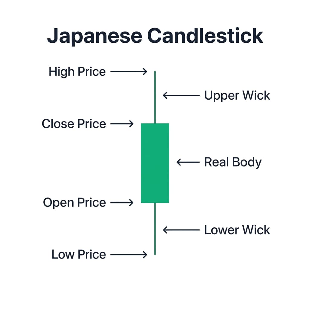
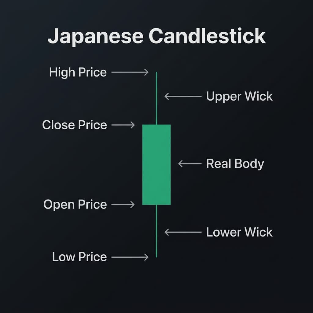
A candlestick packs four prices into one bar: the open, close, high, and low. The wicks show rejected prices where buyers or sellers lost ground.

Japanese Candlestick Anatomy Diagram showing Open, High, Low, and Close prices

Japanese Candlestick Price Anatomy: High, Open, Close, and Low

Line charts only connect closing prices, but candlestick charts reveal the full story of every trading session. Each rectangle represents a single period, showing where the price opened, where it closed, and how far it stretched in between.

The colored box, the body, shows the distance between the open and close. A green or white body means buyers pushed the price higher by the closing bell. A red or black body means sellers drove it down. The thin lines poking out from the top and bottom are called wicks or shadows.

Those wicks represent rejected price levels. A long upper wick shows buyers tried to push the price up, but sellers stepped in and hammered it back down before the close. For Maya, learning to read wicks means seeing where momentum stalled, showing who won the daily tug-of-war between buyers and sellers.

31 min read

Green vs. Red Candlesticks: Bullish vs. Bearish Price Action

TL;DR

A green candle means buyers won the session (Close > Open); a red candle means sellers won (Close < Open). The wicks show rejected price extremes.

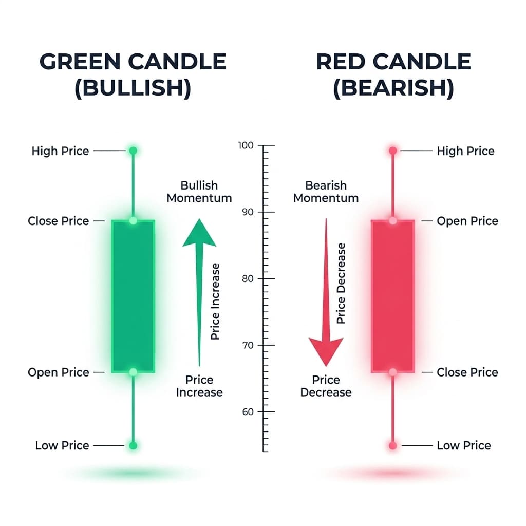
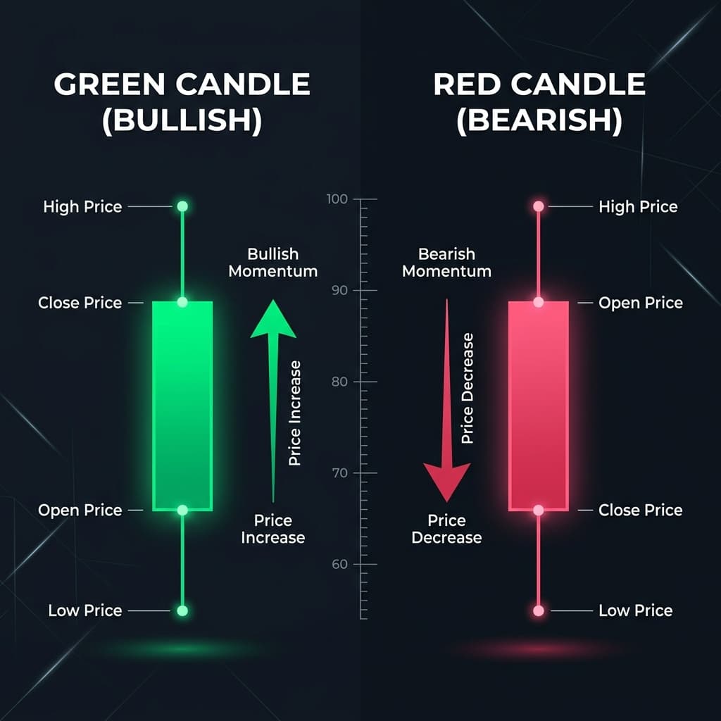
Green vs Red Candlestick Comparison Diagram

Green (Bullish) vs. Red (Bearish) Candlesticks: Open vs. Close Price Positions

The color of a candlestick tells Maya who controlled the trading session from bell to bell. A green candle indicates a bullish session where buyers won: the stock closed higher than it opened. The open price sits at the bottom of the real body, and the close price sits at the top.

A red candle indicates a bearish session where sellers won: the stock closed lower than it opened. While Jake panics whenever he sees a red candle, Maya knows it simply means the open price was at the top of the body and the close price at the bottom.

Wicks behave similarly on both colors: top wicks point to session highs and bottom wicks point to lows. However, a long upper wick on a green candle shows buyers ran out of steam, whereas a long upper wick on a red candle shows a failed rally.

41 min read

Support & Resistance: Price Memory

TL;DR

Support is a price floor where buyers consistently step in; resistance is a ceiling where sellers take profit. Market memory makes these levels repeat.

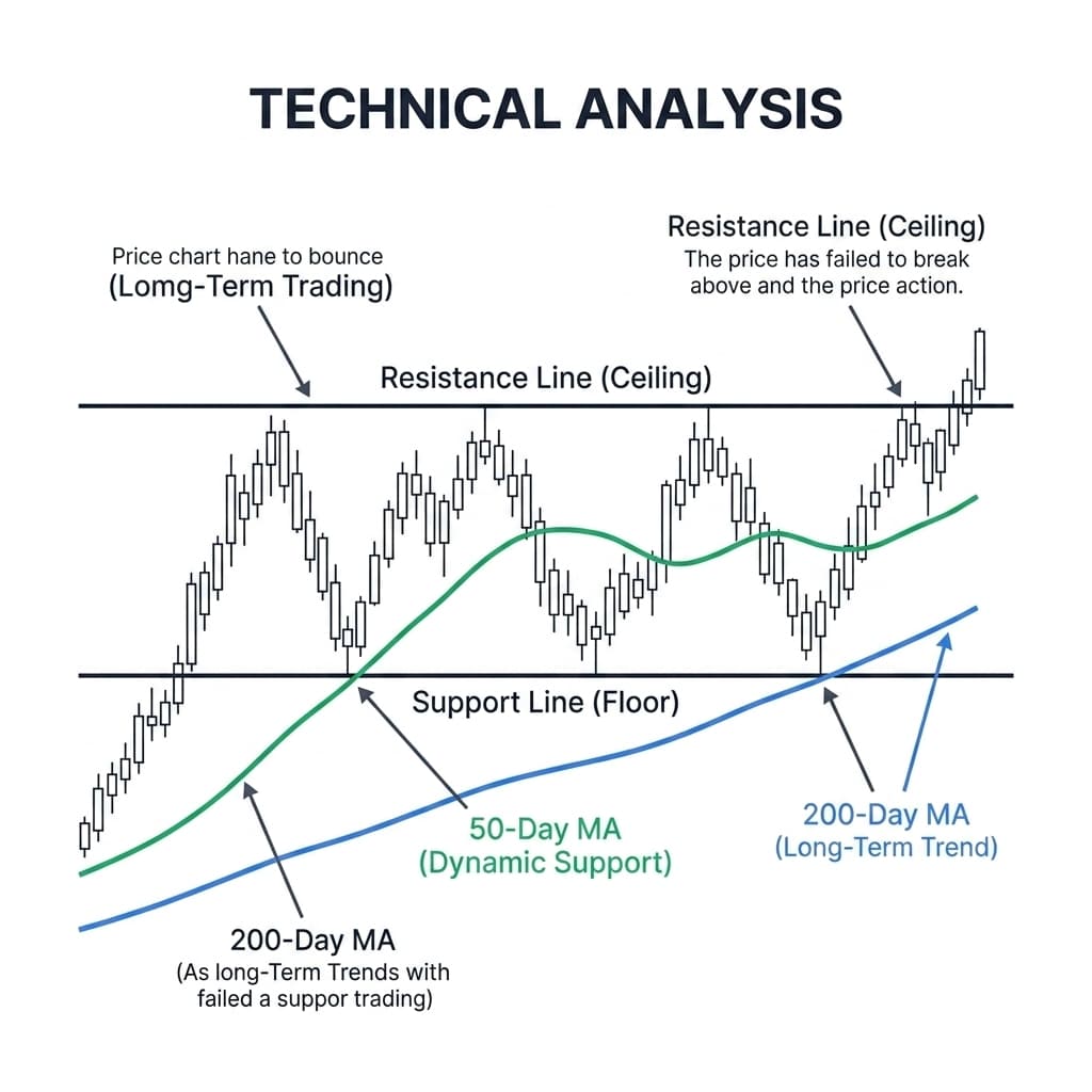
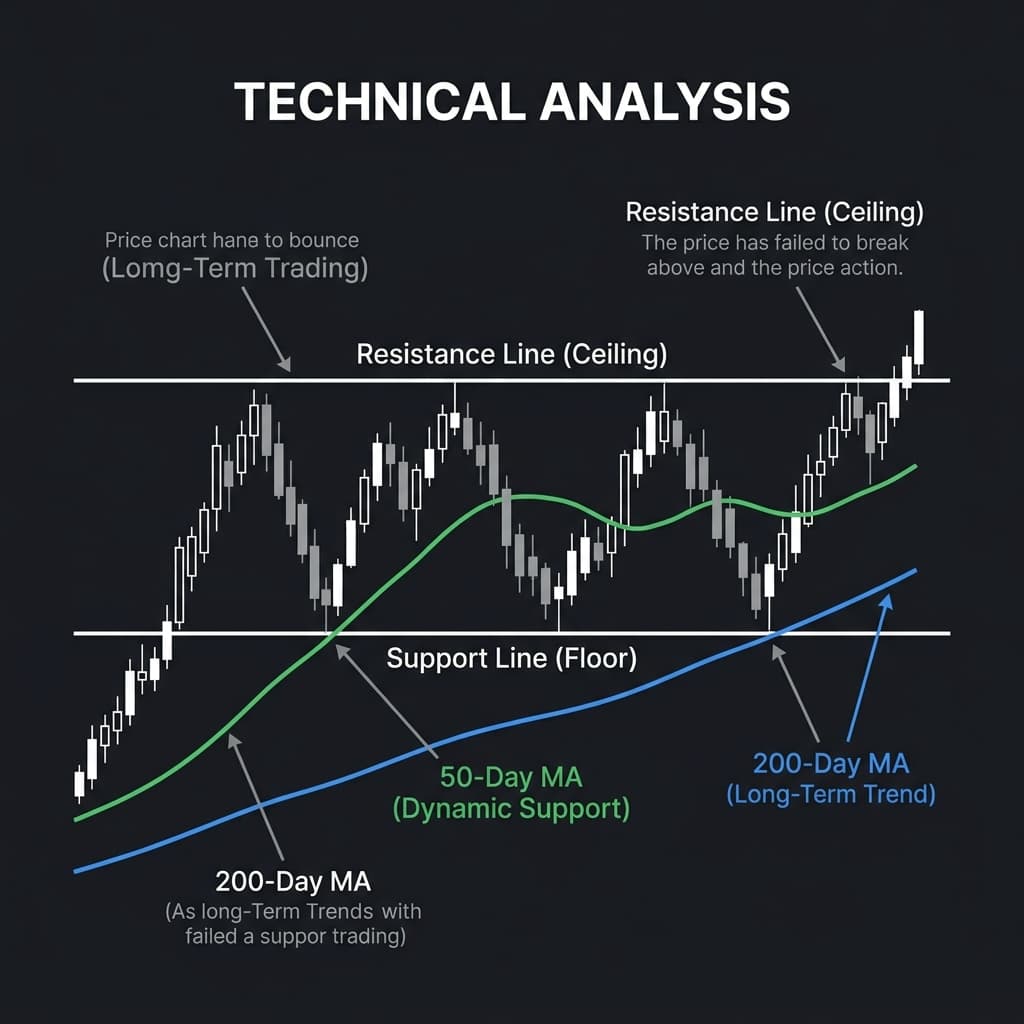
Support, Resistance, 50-Day MA and 200-Day MA Technical Analysis Chart

Visualizing Support (Floor), Resistance (Ceiling), 50-Day MA, and 200-Day MA Dynamic Levels

Imagine a stock price bouncing inside a two-story house. The floor underneath is support: a price level where buyers consistently step in because they believe the stock has gotten cheap enough. Every time the price drops toward that floor, demand overwhelms supply, and the price bounces back up.

The ceiling above is resistance. While Jake often buys right at a resistance ceiling hoping for a breakout, sellers consistently step in there to lock in profits, pushing the price back down.

These levels exist because investors have memories. Buyers who missed out on the last bounce wait to buy at the floor again, while sellers who regretted not taking profits at the ceiling wait to sell there next time. Support and resistance aren't magic lines, but psychological barriers created by thousands of traders remembering the same price points.

51 min read

Trends: The Market's Only Real Friend

TL;DR

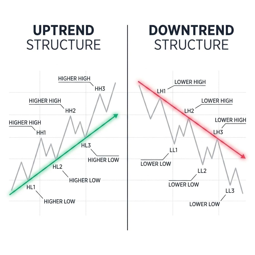
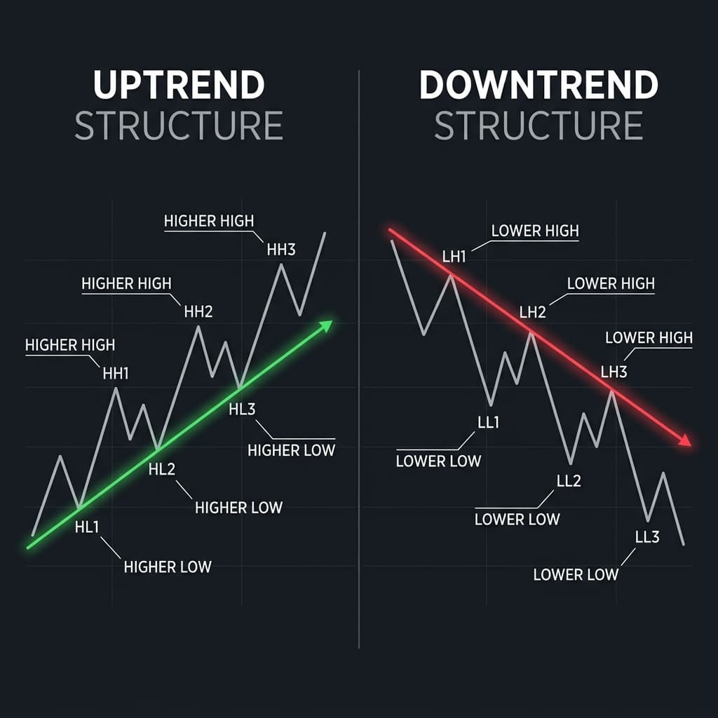
An uptrend forms higher highs and higher lows; a downtrend forms lower highs and lower lows. Riding the trend is easier than guessing tops or bottoms.

Uptrend vs Downtrend Technical Analysis Structure Diagram

Uptrend Structure (Higher Highs & Higher Lows) vs. Downtrend Structure (Lower Highs & Lower Lows)

Prices rarely move in a straight line, but over weeks and months, they move in clear directions called trends. An uptrend is a series of higher highs and higher lows. Even when the stock pulls back temporarily, each drop stops at a higher level than the previous one, showing that buyers remain in control.

A downtrend is the exact opposite: a slope of lower highs and lower lows. Every attempt to rally dies at a lower peak than the last, showing that sellers dominate every bounce.

For Maya, recognizing the trend is essential. While Jake tries to pick the exact bottom of a crashing stock (catching a falling knife), Maya buys in the direction of an established uptrend, aligning her trades with the broader momentum of the market.

61 min read

Moving Averages: Smoothing Out the Noise

TL;DR

Moving averages smooth out day-to-day noise into a single dynamic trendline. Institutions watch the 50-day and 200-day averages as key trend boundaries.

100% Real Market Data · 2025–2026 YTD

Apple Inc. (AAPL) Moving Averages

Price50-Day SMA200-Day SMA
Jul 2026 Price$332.36
50-Day SMA$311.30
200-Day SMA$274.20
$180$220$260$300$340Jan 2025Apr 2025Jul 2025Oct 2025Jan 2026Apr 2026Jul 2026

Actual historical monthly adjusted close data for Apple Inc. (AAPL) from Jan 2025 to Jul 2026. Hover over data points to inspect exact prices and moving averages.

Daily stock prices jump around constantly due to headlines and noise. In 2026, when Apple Inc. (AAPL) traded near $230, daily fluctuations made the short-term chart look erratic. A moving average smooths out those daily spikes into a clean trendline.

The green 50-day line ($212) captures short-term momentum, while the blue 200-day line ($195) reflects long-term structural health. When AAPL pulled back toward $212, institutional buyers stepped in right at the 50-day average, causing the stock to bounce and resume its rally.

While Jake reacts emotionally to every single red day, Maya watches these institutional lines. Because fund managers and automated algorithms track the 50-day and 200-day averages, they act as dynamic support levels, providing an unemotional view of AAPL's true direction.

71 min read

RSI: Oversold vs. Overbought

TL;DR

The Relative Strength Index (RSI) measures price speed on a scale of 0 to 100. Above 70 means overbought (stretched high); below 30 means oversold (stretched low).

100% Real Market Data · 2025–2026 YTD

Microsoft Corp. (MSFT) Stock Price & RSI Oscillator

MSFT PriceRSI (14)
Jul 2026 Price$397.75
RSI (0 to 100)42
Signal StatusRebound
Panel 1: MSFT Monthly Adjusted Stock Price ($)$350$400$450$500$550
Panel 2: Relative Strength Index (RSI 0 - 100)Oversold < 30 (Buy)Overbought > 70 (Caution)
7030Jan 2025Apr 2025Jul 2025Oct 2025Jan 2026Apr 2026Jul 2026

Actual historical monthly adjusted close and 14-period RSI data for Microsoft Corp. (MSFT) from Jan 2025 to Jul 2026. Notice how MSFT's price bounced upward after RSI dipped below 30 in March 2025 ($371.73 → $529.27) and March 2026 ($369.37 → $450.24).

When a stock surges quickly, it can get ahead of itself. The Relative Strength Index, or RSI, measures price speed on a 0 to 100 scale. Readings above 70 indicate overbought conditions (stretched high), while readings below 30 signal oversold conditions (stretched low).

In March 2025, Microsoft Corp. (MSFT) fell to $371.73 as its RSI dropped to 28 (oversold). While Jake panicked and sold at the bottom, Maya recognized the oversold signal. Institutional buyers flooded in, driving MSFT up to $529.27 by July 2025.

Conversely, when MSFT's RSI crossed 81 in July 2025, Jake chased the vertical rally right before the stock pulled back. For Maya, RSI acts as a dashboard warning light: buying when RSI is below 30 aligns with historic value rebounds, while avoiding buys above 70 prevents buying at temporary peaks.

81 min read

Volume & Momentum: Institutional Conviction

TL;DR

Trading volume shows how many shares changed hands. A price breakout on high volume shows real institutional backing; low volume signals a weak fakeout.

Volume Lie Detector Test

Breakout vs. Low-Volume Fakeout

Breakout Volume8.5M Shares (Heavy)
Institutional SupportConfirmed (Pensions/ETFs)
OutcomeSustained Uptrend ($114)
Panel 1: Stock Price ($) & Resistance Line ($100.00)$100.00$90$110$94.00$96.50$104.00$108.50$114.00
Panel 2: Daily Volume (Millions of Shares)1.2MMon1.5MTue8.5MWed7.2MThu6.8MFri

Wednesday volume spikes to 8.5M shares as institutions buy heavily. The high volume confirms the breakout above $100.00 resistance.

Price tells Maya where a stock went, but volume tells her how much conviction was behind the move. Volume is simply the total number of shares traded during a given period, displayed as vertical bars along the bottom of the chart.

When a stock breaks above a resistance ceiling on massive volume, it means institutional buyers and pension funds are piling in with real money. That heavy volume confirms the move is authentic and likely to continue.

If a stock breaks out on tiny volume, it means retail traders are pushing the price higher without institutional support. While Jake often falls for these low-volume fakeouts right before they collapse, Maya waits for heavy volume to confirm real institutional backing before making a move.

91 min read

Stop-Loss Orders: Protecting Your Downside

TL;DR

A stop-loss order automatically sells your position if the price drops to a set trigger point, turning a technical breakdown into a small, controlled loss.

Risk Management Breakdown

Stop-Loss Order: Maya vs. Jake ($50 Entry)

Entry Price$50.00
Stop-Loss Limit$42.00 (-16%)
Final Portfolio Impact-$8.00/sh (Capped)
$50.00$44.00$42.00$50.00Entry$44.00Test Support$42.00Breakdown$42.00Auto-Exit$42.00Protection

Maya sets a stop-loss limit at $42.00 (below support at $44.00). When support breaks, her broker automatically exits, capping her loss at -$8.00/sh.

The biggest risk in trading isn't being wrong about a stock, it's staying wrong while a small loss turns into a catastrophic one. A stop-loss order is an automated instruction given to a broker to sell a security when it reaches a specific price level.

If Maya buys a stock at $50.00 near support at $44.00, she sets a stop-loss limit at $42.00. If support breaks and the price plunges, her broker automatically sells her shares at $42.00, capping her loss at $8.00 per share.

While Jake refuses to set a stop-loss, holding a falling stock as it collapses to $25.00 (-50%), Maya relies on automated rules. A stop-loss removes emotion from risk management, ensuring that when a chart pattern fails, the damage to her portfolio remains small, planned, and survivable.

10Phase 5 Story

Story: Jesse Livermore: Tape-Reading Triumph in 1929, Ruin from Broken Rules

TL;DR

Jesse Livermore made $100 million in 1929 reading tape and price action, but later lost his entire fortune by ignoring his own strict risk management rules.

Historical Cautionary Case Study

Jesse Livermore: Peak Triumph (1929) to Ruin (1934)

1929 Milestone
The Great Crash ($100M Peak)Legendary Peak

Shorted the US market ahead of Black Tuesday. Netted $100M ($1.5B+ today) while Wall Street collapsed.

$100M$1M1907$3M1915$100M1929$01934

“Markets never change because human nature never changes.” Click milestones above to inspect how following vs. breaking risk rules dictated Livermore's fortune.

Jesse Livermore was the original master of price action. In the early 1900s, without computers or indicators, he studied ticker tape prices to identify trends, breakouts, and market tops. In October 1929, while Wall Street panicked during the Great Crash, Livermore shorted the market, making over $100 million in a single week, making him one of the richest men on Earth.

His system was built on strict rules: trade only with the trend, cut losses fast, and never average down into a losing position. But Livermore struggled with emotional discipline. In later years, he broke his own rules, taking massive unhedged bets and ignoring stop-loss boundaries.

By 1934, he had lost his entire fortune and declared bankruptcy. Livermore proved that technical analysis and price reading can generate immense wealth, but without unwavering discipline and risk control, even the sharpest chart reader can lose everything.

Next up

Phase 6: Options

← Back to Blog